
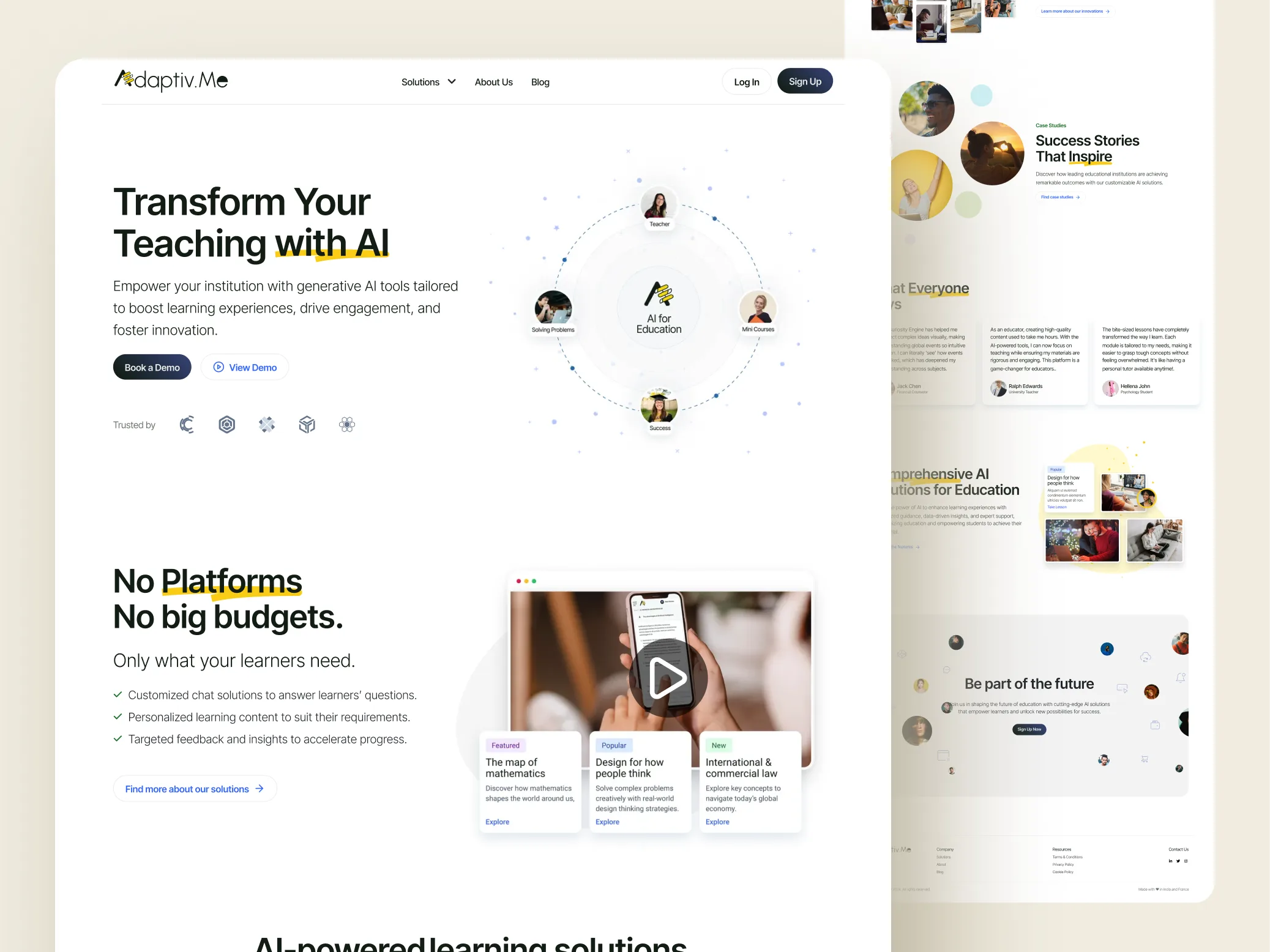
The brief
Adaptive.me needed a website redesign that improved how visitors understood the product and — critically — how often they converted. The existing experience was not matching the ambition of the learning product behind it.
The challenge
Learning products compete on clarity. If the site feels dated or confusing, trust drops before anyone tries the product. Adaptive needed stronger hierarchy, cleaner storytelling, and conversion paths that did not feel like afterthoughts.
Approach
We audited the live site for friction: weak hero messaging, unclear next steps, and visual density that fought the content. Then we redesigned around a simpler narrative — what Adaptive is, who it is for, and what to do next — with typography and layout that feel current without getting loud.
What we redesigned
- Primary marketing pages and key conversion moments
- Visual system updates for a more modern, confident feel
- Clearer CTAs and pathing through the offer
- Responsive behavior that stays readable on small screens
Outcome
After launch, Adaptive saw a 30% increase in conversions. The site now supports the product story instead of getting in its way — which is the whole point of a redesign for a learning brand.